
The dashboard provides AI and data-backed information on the crypto market to communicate it to the users in a more simplified way. The goal is to shorten the time spent searching for market insights by providing them for users who wish to make informed investment decisions. Product development for this dashboard included two phases. The first phase was the soft launch, where I orchestrated a series of usability tests using the Figma prototype. The users and investors could see the product's vision and test it for themselves. This soft launch has boosted investments for the company. My prototype of a fully functional version of the experience has shown the team any pain points that need work based on the user insights. For the second phase, I worked with the front-end team to create the BETA, taking into account all the learnings from the research phases. The BETA is now available, with more improvements to come once the market gets back on its feet.


.gif)
.gif)
.gif)
.png)
.png)
.png)
.png)


.png)


Step 1 : Usability testing the competitors
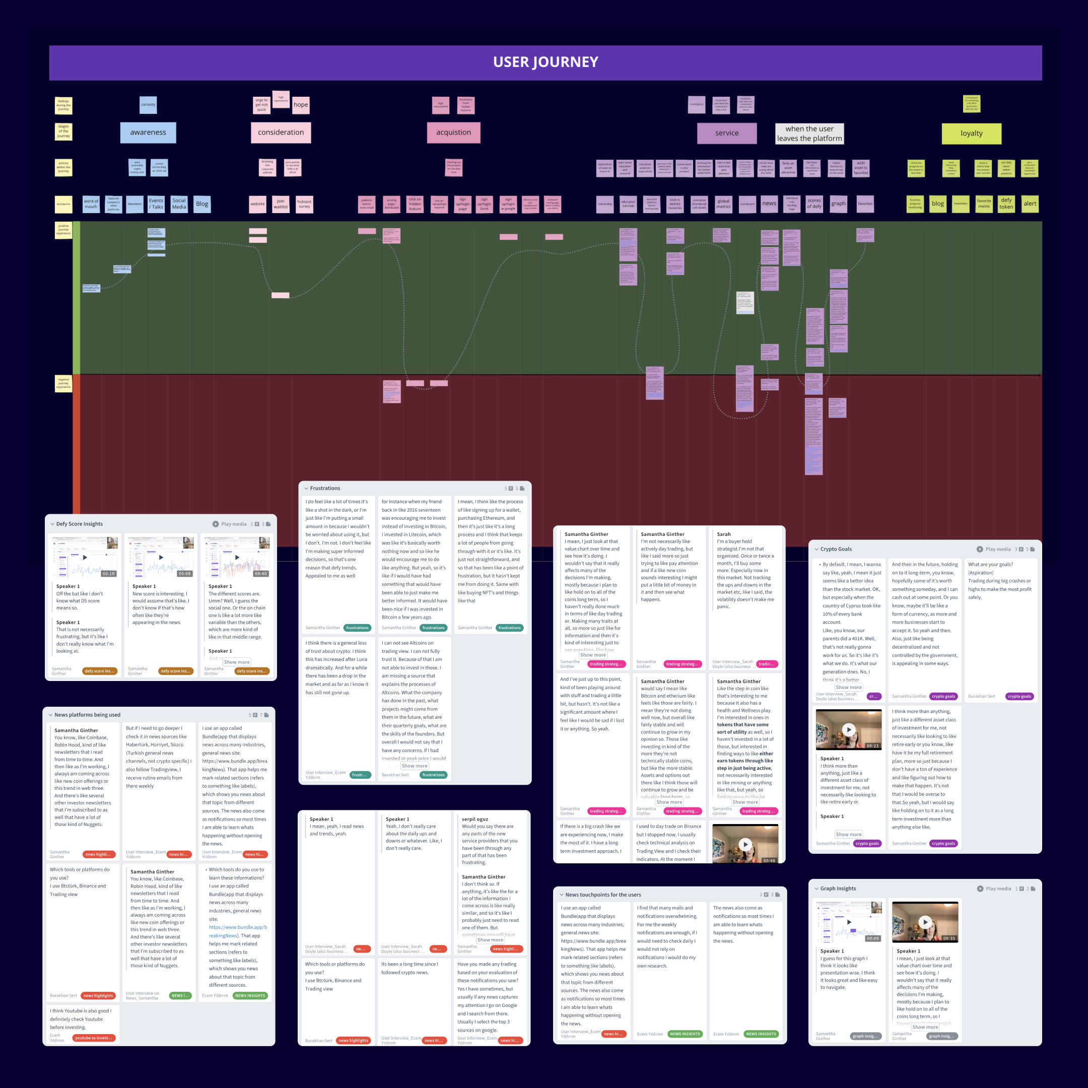
I conducted a stakeholder workshop to understand the client's business and stylistic expectations as well as any challenges and limitations the business faced. As part of the discovery stage, I researched competitors and the target user group by creating a survey that focused on the target users' experience with their favorite products amongst the client's competitors. I facilitated a series of online usability tests on the most popular competitor products found in the survey. Combining all the findings, I created a user journey map and facilitated a series of meetings to develop the information architecture. This process helped the client better visualize and prioritize the users' needs.
Step 2 : UX audit
After the research and discovery process, I evaluated the user experience and content based on the findings of internal test sessions to find flaws and advantages of the product. Before the discovery and audit steps, the client was focused on a very ambitious list of features and spent a lot of budget and time producing those. By combining the results of the usability tests done on competing products with similar features, we could see which features are a home run for the user and which are not as valuable. I proposed to direct the focus on editing the product features to spend the efforts on aspects of the product that will bring value. As a result, the team focused on constructing quick solutions and finalizing the information architecture.
Softwares or applications used: Condens, Miro, Figma

Step 3 : UX design
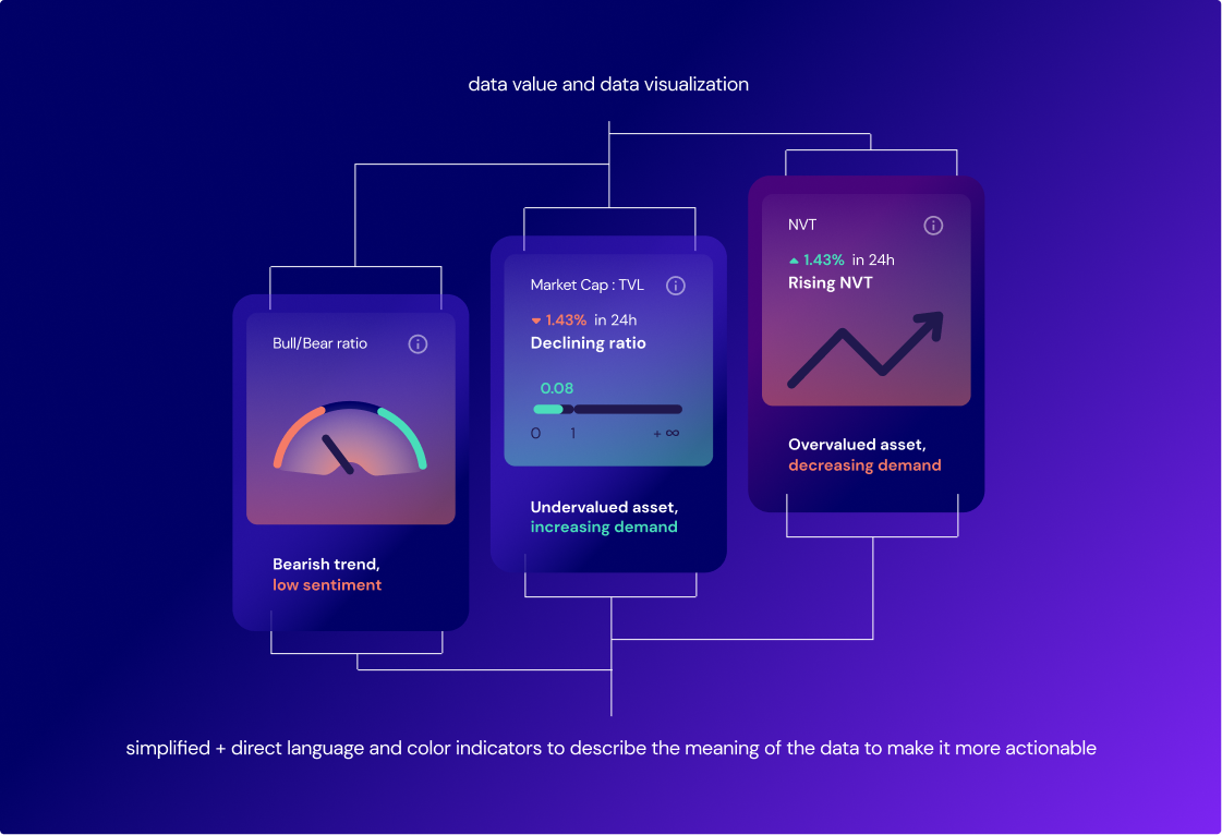
I created a series of lo-fi wireframes based on the revised product concept. Those were tested internally, and an iterative process took place until user flows were refined for each interaction. A lot of the production time was spent on data visualizations and making them easy to understand by the product's target user group. After the refinement, I created hi-fi wireframes to communicate the vision with the data team and the developers to kickstart the back-end work on complex features. Five users tested the hi-fi wireframes externally in another round of online usability test sessions I facilitated.
Softwares or applications used: Figma, Condens

Step 4 : UI design and functional prototype
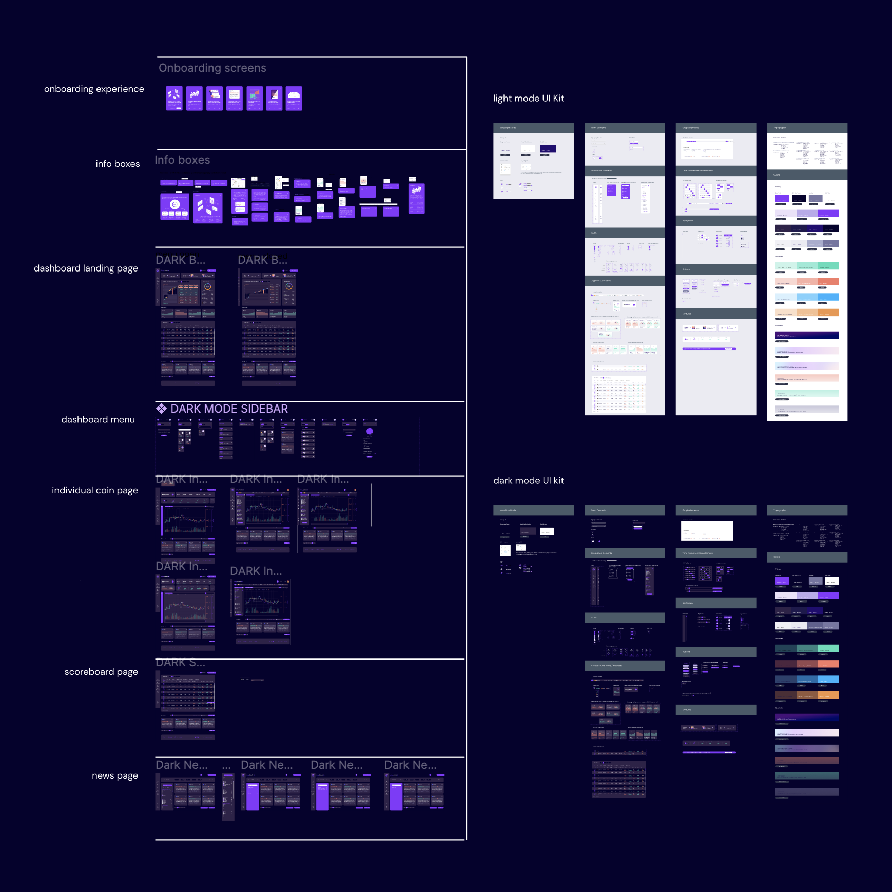
The design team created a renewed visual identity by staging a new color story, mood board, typography, UI style, and iconography. I made a UI kit and worked with the front-end team to adapt the UI kit to Storybook. While the product matured, it was far from ready as the beta version as the engineering work and UI needed to be completed. It was essential to manage the client's expectations at this stage of the project, as the biggest challenge was tight deadlines for investor meetings where potential investors would evaluate the finished beta version of the product. As a solution, I managed the process of redirecting the energy to create a fully functional prototype in Figma and a compelling product design pitch. I worked on producing the prototype and the UI design while the design team filled in the data and helped make the product look and feel real. The strategy worked, and the team achieved the desired outcome from the investor meetings as they could showcase the product's flow and functionalities with a prototype. This strategy helped the startup raise money and get several investors.
Softwares or applications used: Figma, Storybook
Step 5 : Usability tests of the final UI
The beta version of the product was prepared to be tested by the users, and I facilitated usability test sessions of the beta with four users. The beta faced technical issues at times and presented as a challenge for the process to move forward. The prototype was a great support during any pauses or crashes of the beta during meetings with users and investors.
Softwares or applications used: Condens, Hotjar
Step 6 : Updating designs and iterating
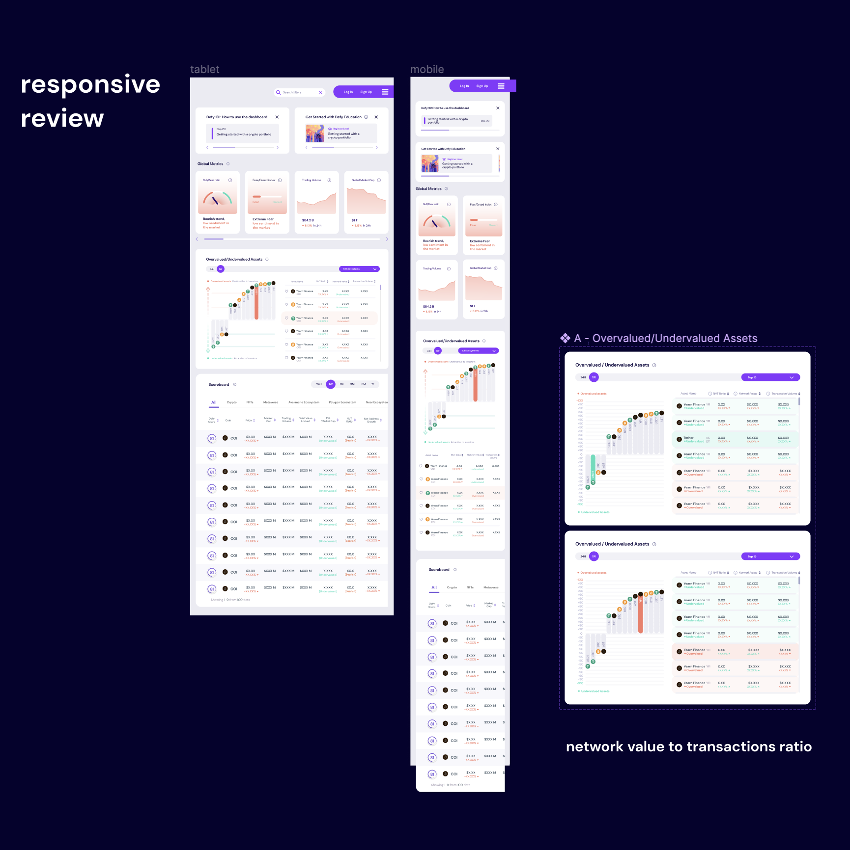
I detected any changes that needed to be made based on the feedback received from the users. The product's beta version became live and the design work continued towards fine-tuning the data visualization and responsive layout.
If you would like to hire me for a project, or have a geeky chat about design, or both - then send me a message below and I will get back to you as soon as possible.


